
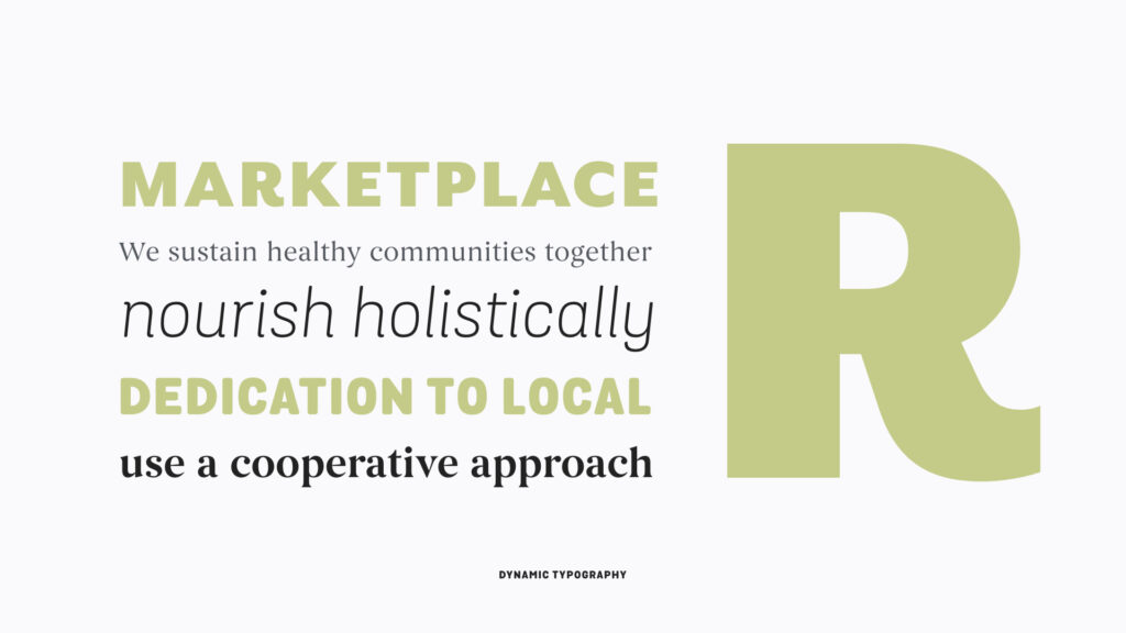
The relationship between fonts give a brand its identity and its messages a voice. When used effectively, typography plays a critical role in establishing the tone of Weaver Street Market’s brand expression. The system is built around a singular primary typeface as its base and includes dynamic pairs that can be used on signage where we want to make the brand feel more conversational.
Dynamic Typography
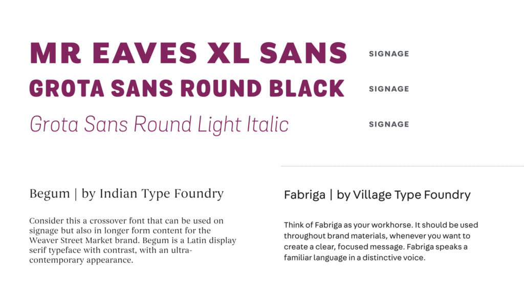
Mr Eaves XL Sans, Grota Black, Grota Light Italic, and Begum Regular are all typefaces that are part of a dynamic type system. These typefaces can be used together on signage when we want pieces to feel more conversational.
Begum and Fabriga are the brand’s primary typefaces for all other brand materials for when we want a voice that is consistent and expresses quality. Think of Begum as a bridge font that connects our dynamic type system to our primary type system. And think of Fabriga as your go-to font for the Weaver Street Market brand.
These fonts should be purchased for those on our team who regularly create marketing materials and in-store experience items. The dynamic typography fonts can be purchased at myfonts.com and the Fabriga font can be purchased through Village Type Foundry. Because Fabriga is the brand’s primary typeface, we recommend purchasing the entire font family.
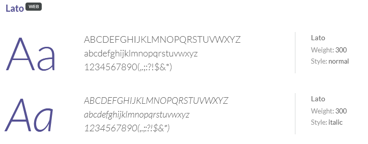
System Font
When the primary typefaces are not available, if you aren’t part of the core marketing team with access to these typefaces, or if you’re designing in powerpoint or email templates where typography options are limited, the Weaver Street Market brand uses Lato. This typeface is an open-source font that can be downloaded for free from Google fonts.
Usage
HTML
<link href="https://fonts.googleapis.com/css?family=Lato" rel="stylesheet" type="text/css">CSS
font-family: "Lato", sans-serif;